Category Archives: Tools

Oral Tech!

Oral History Metadata Synchronizer    http://www.oralhistoryonline.org/

“The Louie B. Nunn Center for Oral History at the University of Kentucky Libraries OHMS provides users word-level search capability and a time-correlated transcript or indexed interview connecting the textual search term to the corresponding moment in the recorded interview online.

  • OHMS Application: The OHMS application is where the work is done. This is the back-end, web-based application where interviews are imported, and metadata is created.  In the OHMS application transcripts are time-coded and/or interviews are indexed.  Upon completion, the interview record (including the synchronized transcript and/or time-coded index) are exported as an XML file.  When located on a web server, the OHMS XML file is what interfaces with your content management system through the OHMS Viewer.
  • OHMS Viewer: The OHMS viewer is the user interface of ohms. When an interview is called by the repository, the OHMS viewer loads, calling select interview level metadata and the intra interview level metadata created in the OHMS Application from the corresponding xml file.”

Examples  http://www.oralhistoryonline.org/examples/

Does this look like a commercial?  I apologize.  Although I am not currently working with Oral History, I have conducted and tried to utilize oral history in the deep dark past before the interviews were videotaped and indexed.  It was painstaking and the quality variable.  Like many others, I turned to easier sources for my work. This cool new tool is a game changer because it makes Oral History Accessible!  Examining the Resource & guides  indicates that the production is by no means a magic wand.  But the structure eases the transcription process and the data tools make all the production worthwhile, because at the end of it, more people will be able to access the content.  I immediately sent the link to all my friends doing Oral History, who probably already knew about it, because they DO oral history.

There’s No Place Like Home

Landscape, Environment, Location, Community, Local Culture, are really terms that describe Public History, in a space some people call “Home”.  People’s homes and pasts, are their identity.  Public history has a dual responsibility to convey information about the past, but it also has to resonate with the culture it is expressing.  Good public history creates a story that so well reflects people’s identities and captures their memories, that even difficult subjects can be addressed.  Traditionally, history has been drawn from objects and documents that people can feel and touch.  Stories written, passed down orally or conveyed in song or drama helped to portray the human experience through direct contact.

Digital public history expands the tools used to interpret and connect to the past.  For example in “World War One: Love and Sorrow – A hybrid exhibition mobile experience.” Visitors choose from among eight characters in a mobile application to guide their museum experience.  This character and Bluetooth technology helps them personalize and focus on specific aspects in the themes of the exhibit: ‘Spirit of the Times’, War Experience, Wounds, War at Home & Life after with the ultimate goal of exploring the true cost of war.  The character & technology particularly enable the visitor to identify with the Victorian Gaze, encounter stories that are usually avoided, and engage and debate in new ways and expand access to resources and the exhibition beyond the gallery through on-line support.  Technology creates an excitement and a new interesting way to challenge what might first appear to be a familiar past.

Digital History is mediated.  It is viewed through a lens that may be video (camera angles and focus determined by the director) or captured and digitized documents, images, or collections. These processes make the object more accessible and usually more visible or clear, but the context, texture and dimension may be lost.  Often the creation of Digital History requires the assistance of experts who may not be from the local community.  Involving the local community in the creation of these histories can result in better understanding and authentic experience that makes history ‘come alive’.  All history is about connections between people and the forces that are operating around them.  Even when it is local, it is reflective engagement with a period that no longer exists.  Effort is required to make intersections between the past and present both familiar and informative.  Mobile Apps, collected as galleries in sites such as Historypin, Clio & Curatescape Projects, make these connections for resident and visitor (actual or virtual) highlighting the uniqueness and significance of our homes.

Home on the Range

Mobile technology is also providing ways to engage with specific stories of the past in real time and place.  Curatescape Projects, Histories of the National Mall, Museum of London, Street Museum, Walking Cinema, and Murder on Beacon Hill are sites that enable users to access history based on  their physical location bringing up stories that are identified by GPS signals.  Instant information is a daily experience. Providing information when visitors need it addresses the culture that expects choices and is highly time sensitive.  Walls are tumbling.  Institutions that can meet potential audiences at the moment their interest is generated, in styles that are familiar actually draws them into a relationship.  Positive, preference-based experiences helps patrons “get the most out of a visit without having to dig through information that isn’t of interest … this concept while relatively new to museums, is common practice in industry.”  Baer et al.   Learning does not happen only in classrooms.  Having a web presence, makes the museum or public heritage site an active and accessible resource.

According to Mark Tebeau, “oral history and digital practice share an underlying activist endeavor, one that breaks down traditional power relations and re-imagines communities as part of the process of scholarly production.” The Curetescape platform developed first in Cleveland Historical “integrates public history, oral history, and digital humanities practice.”  It provides an alternative perspective by focusing on the storytelling process.  Rather than objects or images, tales are sought from the community and recorded and the stories of the city are collected.  Voices of the past, as well as image and interpretation are immediately available in the geo-located spot. Mobile technology is like a tap on the public shoulder, raising awareness of the connections of culture and inviting further investigation.  It makes public institutions relevant in daily activity and on the street!

ET Phone Home

Integrating the analysis of “landscape” and digital humanities reinforces specific practices and raises new awareness of some practical considerations in my mind.  It is significant that that all “homes” are not the same.  Reflecting on how and why a ‘place’ has its own unique character and how people live and interact in that space, is enriching to both the people that live there and visitors.  Locating actions, events, connections and people to a specific spot helps make them real.  ‘Anchoring’ locations, serves the same purpose as a timeline, enabling us to identify connections of human activity and aspiration.

When we tell our stories we need to recognize that people come from different homes that impact their experience of the story.  This ‘home’ arises not only from their cultural background which may differ from the site of the story, but also in their interests and means of engagement:

  • The “Idea” person likes to understand how the ‘big picture’ works.
  • The “People” person is attracted to personal and emotional connections.
  • The “Object” person is attracted by the aesthetics of the object.
  • The “Physical” person seeks physical and sensory experiences.

Baer, et al. “Beyond the Screen”

Our stories will be better appreciated and understood if we include ‘handles of familiarity’ for our audiences to grasp and connect.  There are practical considerations of presentations no matter the location: do people have access to the technology, are the instructions clear, what are the difficulties a stranger might experience, etc.  “Design” is the tool we can use to reflect on the entire experience of the engagement.  The design process includes far more than colors or letter styling.  If we approach digital humanities projects with the concept of collaborative design, an inclusiveness of expertise, resource, engagement, audience,  tools, and perspectives, we have a much higher chance of success.

“The purpose of a museum experience, public heritage site, (or good digital humanities project) is to create ‘memorable moments’”. Hart  Homes are spaces filled with the good and the difficult and they shape our experience.  When we open our homes, guests bring new ideas.  We share our experiences and our stories.  Our lives are understanding increases and our lives are richer.

Notes:

Tebeau, Mark. “Listening to the City: Oral History and Place in the Digital Era.” Oral History Review 40.1 (2013): 25-35.

Hart, T. and Brownbill, J. “World War One: Love and Sorrow – A hybrid exhibition mobile experience.” In Museums and the Web Asia 2014, N. Proctor & R. Cherry (eds). Silver Spring, MD: Museums and the Web. Published September 19, 2014.

Baer, Brad, Emily Fry and Daniel Davis. “Beyond the Screen: Creating interactives that are location, time, preference, and skill responsive.” MW2014: Museums and the Web 2014. Published February 1, 2014.

Cleveland Women: Project Proposal

Cleveland Women: A Prototype public humanities website dedicated to promoting access to digital & traditional archival resources in Cleveland and providing a forum for interpreting Cleveland women’s history.

The northeast region of Ohio was created, as the “Connecticut Western Reserve” in 1796, under the Articles of Confederation, within the boundaries of the Northwest Territory.  This property was given to the “People of Connecticut” to compensate for Revolutionary war costs and losses.  The region’s past is deeply rooted in the Calvinistic and Congregational religious and patriarchal traditions of New England.  The public history discourse regarding the settlement, growth and maturation of the Western Reserve rarely mentions women.  The Cleveland Women website is seen as an opportunity for creating an awareness of the role of women in the development of Cleveland and Northeast Ohio.  Historical questions this site will investigate include:  Who are the women of Northeast Ohio?  What was daily life like for area women in times past?  How have they shaped the region?  What forces propelled them into public awareness and public roles?  What is women’s “activism” in Northeast Ohio?  How has our history shaped women’s opportunity today? The site will also provide access to resources that may help answer these questions.

Cleveland Women: A Prototype will utilize Omeka.  “Omeka is a free, flexible, and open source web-publishing platform for the display of library, museum, archives, and scholarly collections and exhibitions.”  Website configuration will consist of: an attractive headline; featured interpretive exhibit; and offer links to major collections and archives about women in Cleveland, including: “The Women’s Archival Collection” located in the Special Collections of the Michael Schwartz Library of Cleveland, Cleveland Memory, the Dittrick Center for Medical History, Cleveland Public Library and others.  The first featured exhibit will present an analysis of “Black Women’s Activism In Cleveland”.  An early depiction identifies Polly Simmons & Eliza Simmons Bryant and their role in creating the Cleveland Home for Aged Colored People at the end of the 19th Century.  More recent history embraces the activism of Mareyjoyce Green and her efforts to combat domestic violence and provide educational opportunities for African American women.  Plug in tools will ease and highlight site navigation.  Prototype components for Current Events, On-going Research, and invitations to Help contribute information and project assistance will be designed.  Ideally, these areas will eventually be made interactive.

Cleveland Women will attract as its principal users: Cleveland & NEOhio researchers, students (K-12 and post-secondary), journalists, and academics, primarily local but also national, who are interested in the specific history of the region or women’s history, or any of the topic areas included within the site (health care, women’s activism, volunteer and charitable organizations, etc.).   The site will coalesce and promote access to Cleveland women’s history.  Persons interested in Cleveland and Northeast Ohio will form the secondary audience for this website.  This audience includes local residents and tourists.  People searching for general local information or subject matter similar to the content that Cleveland Women promotes.  Engaging these users requires an attractive site and the metadata that connects search terms.   Many portals will access links to Cleveland Women including those above and other local history organizations: Western Reserve Historical Society, Dittrick Medical History Center, Maltz Museum of Jewish Heritage, Rock n Roll Hall of Fame, International Women’s Air & Space Museum, Dunham Tavern; State and possibly national women’s research centers like Ohio’s History Connection and the National Women’s History Museum.  Tourist and marketing organizations for the city (Destination Cleveland, the Downtown Alliance and The Greater Cleveland Partnership) are also resources for site promotion.  Cleveland Women seeks to engage and inform!

What to do with Crowdsourcing?

“Crowdsourcing” is a new way of engaging volunteers not directly connected with or employed in the work of Digital Project or organization.  It involves attracting attention to a project, recruiting individuals to help with (supply the labor, complete the tasks for) a project, educating them as to what is required to complete the tasks, finding a way to edit or monitor the quality of their work and sustain the involvement of the contributors until the task is completed.  “Recruiting volunteers” is not a new idea, non-profit organizations have always recruited volunteers to help with tasks.   But, advancements in technology have created both the tools to create new and larger corpus of archival data; and also the means to reach large numbers of potential contributors who can provide assistance in accomplishing tasks related to its processing through digital connections and platforms.

Digitizing documents can preserve records and provide immense amounts of data, but making these digital records accessible often requires additional tasks that cannot be done by computers.  Review and correction of errors in optical scanning, interpreting the meaning of documents, indexing, cataloguing and preparing digital archives for computer processing requires human action and interpretation.  Digital ‘Crowdsourcing Projects’ have developed techniques – both mechanical and social to attract persons to help complete these large and time-consuming processes.   I have studied and compared four specific active digital crowdsourcing projects:

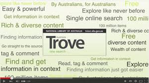
Trove (http://trove.nla.gov.au/result?q=Text%20correction) developed by the National Library of Australia has a 20 year history of crowdsourcing.  First in the assembly of its digital collection calling for the submissions of digital artifacts and newspapers and more recently it has reached out to engaging the general public for completing the monumental task of correcting the OCR text of the Newspapers that have been scanned.  Trove, according to Tim Sherratt is a “Collection of Collections” on all things Australian. (Youtube=APa6-03hWkU) Trove serves as a service resource digitally housing and referral to other significant collections. The newspaper collection “has over 150 million articles covering 150 years of Australian History”.  This collection is the most used part of Trove.  Text Correction, tagging and commenting on this collection has corrected more than 100 million lines of text, “the equivalent of 270 standard work years of effort”. (Ayres, ‘Singing for their Supper’).
Transcribing Bentham (http://www.transcribe-bentham.da.ulcc.ac.uk/td/Transcribe_Bentham)
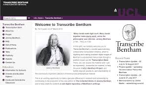
 is located at the University College of London.  This project uses crowds of volunteers to help transcribe the 60,000 folios of unpublished manuscripts of Jeremy Bentham, enlightenment philosopher of Democracy and the father and utilitarianism.  The goal is to complete the publication of all Bentham’s collected writings. (Causer, et al, “Crowdsourcing and editing”).   Individuals register and then participate in transcribing the manuscripts into a textbox using a customized tool bar.  This creates the pre-edit compilation of the manuscripts for the published works and also forms basic encoding that makes the collection accessible in the digital format.  (Causer, p. 120).

Papers of the War Department (http://wardepartmentpapers.org/transcribe.php) is an effort to restore the archive of the U.S. War Department which burned to the ground in 1800.  An extraordinary effort was made to compile the ‘lost’ documents by scanning copies that had been sent to other institutions across the country and Europe.  While the documents were assembled from the 3,500 institutions a rough sort of index was constructed.  The Roy Rosenzweig Center for History and New Media built a website with nearly 45,000 documents to make full text transcription and correction June 2007.  The project uses a tool called Scripto a text compiler module that will work with existing content management systems.  The success of this project in garnering massive participation has been somewhat limited, but the “lessons learned” about crowdsourcing and tool development have made the contributions of the Papers of the War Department project substantial.

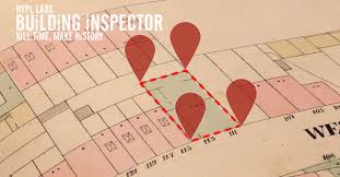
One of the “latest and greatest” crowdsourcing projects’ which has been able to capitalize on these lessons is NYPL’s Building Inspector (http://buildinginspector.nypl.org/).  This project was created with the intent of “gamification” (making the task feel like a game).  Fire and Insurance maps of New York City from the 1850’s to 1950 were digitized.  Because the maps were made to different scales and from different angles, the digitized information was then vectorized (this is a mathematical process which creates lines from the digital point data creating a graphing matrix.  The Python Program was used to extract the polygons that formed the building footprints on the maps (80,000 polygons). For the mapping tasks NYPL labs have adapted LeafletJS (a the leading open-source JavaScript library for mobile-friendly interactive maps). Building Inspector is deployed on Heroku, with map tiles on Amazon’s CloudFront The adaptations for recognizing the buildings are tools developed by NYPL but have been made available on Github.  These tools made it possible to identify recognizable building outlines.  The goal of the overall project is to create year by year of maps that can be overlayed and manipulated to show the physical (and social) changes of New York City.
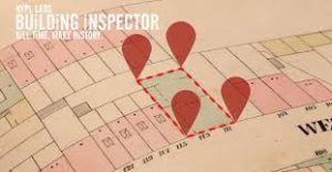
The current “Building Inspector” project is to gain help in verifying and identifying the the polygons of the various digital maps.  There are 5 types of crowd sourced tasks in “Building Inspector”. The 5 tasks: I. Check Footprints presents a map section. A building footprint on the map is defined by red dots, the user simple clicks one of three colored boxes (No, Fix, Yes) to say if the dots match the shape of the building. II. Fix Footprints presents a small section of the map with a building outline. The corners of the buildings are marked by balloon pins. The “inspector” is asked to move, add, delete pins until the building shape is correctly outlined. III. For the Numbering tool, a small map section with numbers is presented. The “inspector” clicks next to the number by the building and a box appears, then the “inspector” types in the number verifying the address of the building. IV. The colors of the buildings (which represent materials and use) are displayed and the inspector clicks on the correct colored box to verify the color of the building. V. For identifying place names on the maps, a flag appears with a box. The “inspector” scrolls around the map to locate the name or location of the object.

A crowdsourcing project requires crowd participation to be successful.  Individuals participated in Transcribing Bentham and the Papers of the War Department because they were interested in the specific history and documents with which they were working.   Sharon Leon observes, “None of these projects are ‘If you build it, they will come.  It just doesn’t work that way.  People will not randomly find you.” (Crowdsourcing: Papers of the War Dept.) Melissa Terras describes “the goal as being to locate 25-30 core users with whom a relationship can be developed, who are committed to the project, locked on the goal and pitching in.” (Crowdsourcing:​ ​Transcribe​ ​Bentham)  Notice these two projects are transcription projects which require patience, diligence and accuracy.  Trove described by Tim Sherritt “as a community, with large numbers of users and some really passionate users….Text correction is one of the most active features on the site… 150 million newspaper articles covering 150 years of Australian history.  There is something in there to attract anyone’s interest. (Sherritt, Crowdsourcing Trove)

Ayers brings this to a finer point…

“an average of more than 60,000 unique users visit Trove every day…. By July 2013, more than 100 million lines of newspaper text had been corrected by members of the public. We have estimated that this equates to more than 425,000 volunteer hours, or 270 standard Australian work years. Costed at the Library’s lowest pay rate, this means that text correctors have contributed more than AU$17 million in value to the service.” (Ayers, “Singing”)

Building Inspector inspired “77,447 inspections the first day ..(it) was available. ..By the 3rd day 163,035 inspections had been completed.” (Summers, “inkdroid”). To date 12 maps have been completed (http://buildinginspector.nypl.org/about  accessed 11/27/17).  According to Mauricio Giraldo Arteaga the Lead Building Inspector developer/designer, it is because “people like to help the library”. (Summers)  Trove’s Marie-Louise Ayres believes “Trove text correctors are primarily motivated by their personal research interests, by the sense of being involved in something ‘bigger than them’ and ‘of lasting value’, and by a very strong sense of giving back or ‘singing for their supper’” (Ayers).  The lesson I am taking away from these experts is that you need to understanding your project well enough to know who your potential crowd is and how they will benefit from participating.

Effective marketing is also useful, but needs to be strategic.  An article about the War Department Papers was published in the New York Times attracting interest, but the site was not ready for participation and missed the bump. (Leon)  Whereas Building Inspector’s released “with the (apparent) coordination with an article at Wired, and subsequent follow up on the nypl_labs Twitter account.” (Summers).  All of these projects also works to create a “relationship” with its users, mainly through time and information.  Trove’s “Engagement features: include tallies. For example:

  • 111,952 newspaper text corrections today
  • 1,453 images from users this month
  • 15,923 items tagged this week
  • 2,054 comments added this month

Building Inspector provides logs for its user on their personal contribution as well as the instantaneous gratification of seeing the polygon corrected! The transcription project editors keep communication flowing with their users on a more personal basis.  Humans are not machines and while they may volunteer, they appreciate the recognition that comes with it.

My own contributions to the Papers of the War Department and Building Inspector have mirrored the above analysis.  While I was more interested in the Papers, I was hoping to find some recognition of my locations connected to my NJ family; I quickly became frustrated with the interface.  I was less interested in helping the NY Public Library, but “Inspecting” is so easy and rewarding that I have done it several times while talking on the phone just to keep myself occupied.  The ability to get connected quickly and easily (Ayers observes that ‘long process, having to register, etc. are less likely to engage new users) is crucial.  Being informed and feeling that your work is valued, easy to follow directions or quick responsiveness to questions are ‘Warm Fuzzies’ necessary to keep your crowd sourcing.  So crowdsourcing requires a great deal of effort in preparation and management, but the value of then having a built ‘audience’ that contributes, shares, promotes and potentially engages with the project in new ways is of great value and an exciting prospect.

Notes:

Ayres,​ ​Marie-Louise.​ ​​”‘Singing​ ​for​ ​their​ ​supper’:​ ​Trove,​ ​Australian​ ​newspapers,​ ​and​ ​the crowd.”​​ ​Paper​ ​presented​ ​at​ ​IFLA​ ​WLIC,​ ​Singapore,​ ​July​ ​31,​ ​2013.​ ​National​ ​Library​ ​of Australia.

Causer,​ ​Tim,​ ​Justin​ ​Tonra,​ ​and​ ​Valerie​ ​Wallace.​ ​“Transcription​ ​Maximized;​ ​expense minimized?​ ​Crowdsourcing​ ​and​ ​Editing:​ ​​The

​       Collected​ Works of Jeremy​ Bentham.” Literary​ and​ Linguistic Computing ​ ​ ​27,​ ​no.​ ​2​ ​(2012):​ ​119-137.

Crowdsourcing:​ ​Transcribe​ ​Bentham https://www.youtube.com/watch?v=XB2J4pJQodo

Leon,​ ​Sharon​ ​M.​ ​“Build,​ ​Analyse​ ​and​ ​Generalise:​ ​Community​ ​Transcription​ ​of​ ​the​ ​Papers of​ ​the​ ​War​ ​Department​ ​and​ ​the Development​ ​of​ ​Scripto.”​ ​In​ ​​Crowdsourcing Our​ Cultural Heritage, edited​ ​by​ ​Mia​ ​Ridge.​ ​UK:​ ​Ashgate,​ ​2014.

Crowdsourcing:​ ​Trove https://www.youtube.com/watch?v=APa6-03hWkU

Summers,​ ​Ed.​ ​“NYPL’s​ ​Building​ ​Inspector.”​ ​​inkdroid​ (blog),​ ​October​ ​22,​ ​2013. http://inkdroid.org/journal/2013/10/22/nypls-building-inspector/​.

 My Approach to Wikipedia

Wikipedia for better or worse has become the global source for instantaneous reference.  As Roy Rosenzweig noted “We have to pay attention because our students do”. (Can History be Open Source) We should pay attention because Wikipedia is ubiquitous.  It is providing the common platform of information and more significantly has changed the way we access and think about information… we no longer have to memorize and learn basic facts because Wikipedia can provide them faster than we can remember them.  Skipping the process of remembering facts does have consequences for critical thinking and application of knowledge.  However, that is a different issue than the one at hand which is the more immediate issue of ‘What do we need to be aware of when reading a Wikipedia article?’

Wikipedia is great for common facts and dates!  It is probably mostly reliable. When searching for a more comprehensive understanding of a fact, event, issue, or idea, it is a good idea to dig deeper into who is involved in the “construction” of the entry.  The entries are created and corrected by ‘everybody’, but this ‘everybody’ is constituted by individual volunteers who have different goals (and differing amounts of time and interest in working with the entry).  An individual, who has just become familiar with a topic, can be interested in demonstrating what they know about it.  A knowledgeable expert might have corrected and clarified an entry; or someone could just be creating mischief and enter random information.  It is useful to know that there is extensive information, but basically 4 pillars for contributors (identified by Rosenszweig) which shape the content of entries:

  1. ‘Wikipedia is an encyclopedia which summarizes and reports conventional and accepted wisdom on a topic that does not break new ground.’
  2. ‘Articles should be written from a neutral point of view’
  3. While “The third “key policy” is simpler: “don’t infringe copyrights.” The reality appears to be that Wikipedia as a general source ignores attribution and often so do its users.
  4. ‘The fourth pillar of Wikipedia wisdom is “respect other contributors’.

According to David Auerback, “Wikipedia’s users serve collectively as legislature, executive, and judiciary” of its content. (“Encyclopedia Frown”). That is not fully true as Auerback indicates in his own blog, there are priority contributors, Wikipedia editors, and a slew of ‘bots’ that monitor and manage the site.  What this information should mean to the user, is  Wikipedia is “probably mostly reliable”, but it shouldn’t really be a primary source if one is writing a term paper or trying to gain a deep understanding of a subject.  However it is a useful tool for quick references and as a lead to other resources for more information on the topic.

Going deeper than the surface with a Wikipedia entry requires asking a few questions: “How did the article develop, who has been involved in its creation and do I judge the information or resources to be reliable?  These questions can be answered by accessing the full Wikipedia site (not just pulling the data from the search engine synopsis).  At the top of the Wikipedia topic page there are tabs for: the Article, Talk, Read, Edit, and View History.  These provide clarification as to who is involved and the context of the article.  The difference between the Article Tab and the Read Tab appears to be sponsored links and information that are applied to the borders of the web page by Wikipedia itself.  The Read Tab allows you to see just the article.  The Talk Tab provides insight into what the larger community involved with the article interprets about what is going on with the article.  This includes: links to larger Wikipedia Projects & how the article is being used; concerns regarding content, general comments, ideas as to how the site could be changed or improved, requests for additional content and notes about links.  The Edit Tab  is where the source code editing actually takes place.  The View History Tab is the log of the edits (and meta data about them) where a user can see how the entry has been changed over time.

There are numerous advantages to checking the “History”.  It is not hard to do once you know it is there.  It reveals how the currency of the information in the article.  It reveals the nature of the changes that have been made.  The user can check into the authority of the contributors, sort of.  Contributors to  Wikipedia can chose to register or not.  Contributors can choose to provide information about themselves or not.  While examining the Wikipedia page for “Digital Humanities”, I found ‘Sophia Chang’, the most recent contributor, did not register.  Therefore I have no basis on which to evaluate her authority except the quality of the immediate corrections – for which I would have to check alternative sources to ascertain their reliability.  “Cluebot” had ‘reverted possible vandalism’ which alerted me that some information might be suspicious.  Another contributor described themselves as “a student studying geology”.  Since I was a geology minor in college and knew nothing about DH  (Digital Humanities), I am skeptical of LuckyLukasS and the “SoftballJunkie”.  On the other hand, Elijah Meeks, who launched the page in January 2006, is a Digital Humanities Scholar from Stanford University, has published extensively and linked his registration to his own Wikipedia page (which has its own history).  Wikipedia provides several “tracking” devices in the History including the ability to look at statistics, search for specific revisions, search edits by user, etc.  This helps a user verify the authority and reliability.  ElKevbo, who has been a longtime contributor-editor, has advanced degrees in education and technology.  Cheryl27, who did extensive revision of the site in 2016, also did not ‘register’, but her edits did a terrific job of reorganizing and updating the page.  The “talk” surrounding her edits, questioned some of her choices, but did not substantially challenge her content or accuracy.  Since the DH page, in the past month has been viewed an average of 423 times and edited 8 times daily, is still a very current and active topic; there is a highly likelihood that errors will be corrected quickly.

The current iteration of the Digital Humanities page reflects  increasing maturity in the discipline of Digital Humanities (DH).  In the early days of the website, the content was basically a definition that made the connection between a Humanities focus in content through the use of Technological tools.  Listing of projects, resources and literature was fairly static and encyclopedic – consistent with the rest of Wikipedia in the early days.  The first embedded file link (to a visualization map) is made March 7, 2006.  Considering this site promoted the use of digital tools, the lack of visual connections demonstrates the limits of both the discipline and the Wikipedia platform.  Through 2009 the majority of links were to external tools, resources and journals that demonstrated collaboration and the expansion of professional literature in DH and history projects that used digital tools.  During the spring of 2010 there is an effort to emphasize the computing in DH, which is resisted by Simon Mahony, a DH scholar with a “Classics” background from the University of London.  The fact that the discipline was emergent is demonstrated by continuous tweaking of the definition.

The period 2011- 2013 reflects the controversy of whether DH is a “professional” community and attributes that would demonstrate its “academic” credentials: concerns over liability & copyright (Dr. Oldekip), definitions of subfields and terminology (ElKevbo), arguments over size of projects ( Dancing Philosopher), literature fields, Centers and Resources appear and disappear.  The page is occasionally visited by Wikipedia editors and clean-up bots and was frequently attacked in 2013.  During 2013 there was also a notable expansion of named DH Centers – which indicates funding, stability and academic recognition. In May 2015, the “methods” section gets a visualization of the ‘Narrative network of U.S. Elections 2012’ which begins to demonstrate the product outcomes of DH.  By Jan 2017, the page is giving a far more extensive reflection of the discipline (reflecting the editorial work of Cheryl27 & Cats and Things – a graduate student studying Wikipedia).  The Table of Contents has been trimmed to manageable subheadings, a somewhat concise, detailed definition of the field has been created emphasizing tools and methods but retaining the collaboration of humanities and very sophisticated digital process and tools.  The values and methods have become lists with explanations of the ideas such as “open access”, Computational methods, examples of project types and most significantly of the interaction between the processes of project and recognition of the impact of these processes in “creating new knowledge” – “Digital humanities is also involved in the creation of software, providing “environments and tools for producing, curating, and interacting with knowledge that is ‘born digital’ and lives in various digital contexts.” In this context, the field is sometimes known as computational humanities.”https://en.wikipedia.org/w/index.php?title=Digital_humanities&oldid=758451224

The page has been made visually attractive and informative by images and links to real DH projects that demonstrate the use of tools and the variety of types of projects (Digital Archives, Text Mining, Analysis and Visualization, Online Publishing.  The organization of the discipline is demonstrated by having an established academic apparatus: a “history”, organizations, Centers & Institutes, Conferences and Publications, Guides, an extensive list of references and bibliography.

The result of all this activity is a page with a nice layout and ease of navigation. https://en.wikipedia.org/wiki/Digital_humanities  The engagement of DH scholars, such as Johanna Drucker provided a foundation definition of the Digital Humanities that clearly identifies the blending of computational (more than just use of the computer) technology and the fields of humanities; has maintained and enhanced the quality and integrity of the information. I, as an individual new to the Digital Humanities, gained a basic understanding and recognition of the discipline. DH is a field where a deep knowledge of the data and experience with the tools is critical to understand fully what is happening in this processing and how the information limited or vast is being engaged, transformed and created.  Wikipedia takes a community and the collaboration on the DH article is a good reflection of a community within that larger community.

Notes:

Auerbach, David. “Encyclopedia Frown.” Slate, December, 11, 2014.

Rosenzweig, Roy.” Can History be Open Source? Wikipedia and the Future of the Past.”  The Journal of American History Volume 93, Number 1 (June, 2006): 117-46 a.


Voyant, CartoDB, Palladio:  Comparing Network Analysis Tools

The goal of these three tools is the same to search and assemble large amounts of data into formats which users can easily manipulate to create visualizations of their data.  The goal of these tools is to enhance research and help researchers provide hard data and evidence for their humanities projects.  The tools help us shape new questions and provide additional options for the portrayal of “ideas of change”, show how people, ideas, organizations or events have common patterns and interactions all of which enhance the meaning  and understanding of the data and the humanist’s ability to teach and share the insights from it.

Voyant focuses on text and identified collections.  It inspires thinking into the nuanced meaning and use of words.  This includes the “power words” within a text and also the auxiliary words which demonstrate a deeper level of language use in a particular context.   Although targeted for the “new to digital technology humanist” and straightforward in its process; if one is really new to the processes and navigates off the script or attempts to add something, there are no ‘aids’ built into the system to help you easily answer questions or solve problems.

CartoDB is a network mapping tool or as Carto describes itself, “An open, powerful, and intuitive platform for discovering and predicting the key insights underlying the location data in our world.”  (https://twitter.com/cartodb?lang=en) This is a more sophisticated program for a new user than Voyant because it has more “built in software” making it more accessible.   CartoDB  focus on the spatial aspects of the data – how it is related geographically.  Layers can be added with new information to enhance the understanding of the connections between relationships.  It is easy to switch between and add maps.  Starting with basic geography, but using GIS reference and point placement, CartoDB  makes the maps for you.  It also projects the maps in different ways using widgets: ‘heat maps’ show concentrations of activities and ‘animated’ maps can demonstrate interactions over time and space, or demonstrate patterns and isolations.  This map is very helpful for clear comparisons and relations.

Palladio describes itself a s a “platform” for network analysis.  This platform has a number of tools and is organized around manipulating the corpus data. When I was using this platform, I had the feeling; I was using a very limited aspect of its capabilities.  “It is designed to manipulate data the way historians think” this is useful for us historians who have trouble “organizing our research” in the same ways that Scientists and Social Scientists do. Palladio enables the contents, of seemingly incomparable elements, get turned into plotable graphs, maps and clouds (spatial comparisons for ideas and categories).  Being able to manipulate the data without having to have the underlying programming expertise is magic. However creating the corpus of data becomes highly significant, more on this below.   The user has to ‘trust’ the logic and ability of the programmer (that the description of what is being done with the data – is being done in the same way the historian “thinks” it is being done).  Decisions are made regarding how to organize the data sets.  Errors can result in huge consequences for interpretation.

When computers were first coming into popular use (1970’s & 80’s) the key phrase was GIGO (Garbage In/Garbage Out).   Manipulating research is pretty powerful and the visualizations ‘lock in’ ideas more definitively than ‘discussion’ does.   As I read about and worked with these tools, I was excited about how a project I am working on Women and Health Care in Cleveland would benefit by their use.  The “tools” will provide quick ways to visualize the impact of location and intersecting relationships we have been struggling to describe.  Each tool can help us see the data from a new perspective and solidify, highlight our findings or indicate new questions.  But, these tools cannot fully explain all the “whys” of the locations; the personalities, beliefs,  or causes of actions.  Missing records from whole segments of Cleveland’s population would not be “factored in”.  As I worked with the individual tools, it became evident how each of the projects that used them, needed to modify them to suit their own data and questions.  The itemization of the “Grant Support” is evidence of the need for modification, and support for programmers and editors to work with the researchers so that the questions are being addressed thoroughly and potential problems recognized and documented so that we do not generate (in today’s vernacular) “Fake History”.

Utilizing multiple tools is one way to avoid egregious errors and explore the data more deeply.    Use of Voyant  on the text of the Slave Narratives reflected the use of language which evidenced the fact that the slaves being interviewed were mostly plantation based and isolated.  CartoDB demonstrated that “Alabama” interviews were not conducted all over Alabama, but in pocketed areas.  It also provided evidence that the numbers of interviews peaked in 1937 (but the data did not indicate why).  The similarity and limitations of the script used in the interviews was evidenced in Palladio by a cloud diagram of topics.  These tools provide amazing insights, enable analysis that would not be possible without the speeds of text manipulation and they are great aids to the craft of history.

Playing with Palladio

Just like a kid at a table, I was given some preformed clay and told to make some beautiful works.  Not having to do “the set up”, Palladio was relatively easy to get “into” network analysis and start messing around.   Palladio is a “general-purpose suite of visualization and analytical tools” that enables researchers to map and graph humanities data. (http://hdlab.stanford.edu/palladio/about/)  When we are discussing data here we mean “corpus” (techie term – compilations for the rest of us) of, in my case, the historian’s research (people, events, addresses, dates, contacts, documents, etc.).   The data can be vast amounts of material (text, photographs, tables, etc.) or relatively small collections.   The software in the platform through the use of algorithms (sets of directions) transforms our element (node) into a “plotable point on a map or graph.  The schema for assembling, disassembling and reassembling produces various kinds of maps, graphs, constellations all with the associated metadata accessible.  These manipulations draw (“edges” for the techies) “connections and patterns” (for the rest of us) that can be seen.   These “visualizations” foster enhanced understanding of the data itself and make obvious how elements within the data are connected or not and because of the ability to “play” (isolating “ALL” the variables and being able to test relationships or time series, in space or against a physical map) new questions are brought to the researchers mind, hypothesis can be verified and various problems or possibilities can be explored and addressed.  Our ‘Ideas’ become pictures that enable us to work with them, without losing track of them, from various perspectives.

The designers of Palladio built it for mapping the correspondence metadata of a project called “The Republic of Letters” which explores the connections of Enlightenment Intellectuals and  the transference of ideas through their letters.  (Visualize massive amounts of text in multiple languages).   Palladio understands the historian’s mind and methodology,

“It is an environment that supports thinking through data. Like so many historical sources, the (data) is incomplete in unpredictable ways. Historians work with fragments of information from the past, not complete data sets. ..tools need to support scholars in building an understanding of the historical material through working with it. To create Palladio, we had to externalize what is a very internal, individual, thought process. “  http://hdlab.stanford.edu/palladio/about/

My trial experience working with Palladio centered around a data set created by Prof. Robertson from the Works Progress Administration Slave Narratives. (https://www.loc.gov/collections/slave-narratives-from-the-federal-writers-project-1936-to-1938/about-this-collection/ ) Since I was able to upload ‘Palladio prepared data’, I was able to avoid a time consuming task of aligning my data for Palladio manipulation.

It was relatively fast and easy to create the primary table (main data set) against which other tables (elements of the data) could be manipulated.  For the Slave Data, the primary data set was the Alabama Slave Interviews and the subtables were identifications of the former slaves that were interviewed and data about the interviewers.  Once the tables are created, they can be analyzed with various tools including locating the slaves/interviews on a map, drawing connections between an interviewer and the slaves interviewed, creating network analysis of various types by the individual elements within the data sets.  The “visualizations” I made included maps, string and cloud diagrams (okay I admit– I got interested and played with time series and graphs as well).   It was fascinating and time consuming to try different arrangements that suggested unique relationships, impact of place and Slave occupation.  Also revealed were limits in the veracity of the data (not a reliable reflection of slave tasks or a true reflection of statewide representation), but also new issues to consider, such as how does the gender of the interviewer impact the questions used in an oral history interview?

Palladio describes itself as “a tool for reflective practice.”  Both Scott Weingart (“Networks Demystified” Blog December 5, 2013) and Ryan Cordell (“Reprinting, Circulation and the Network Author in Antebellum Newspapers”),  call to our attention that compiled data has its issues, in the same way normal archival research has gaps and biases and snags.  It is easy to see how visualizations could cause erroneous interpretations.  And truly the data is just a picture of the facts and still requires interpretation as to its meaning and significance.  So the mind and integrity of the historian is still crucial to good history…but new Playdough is always fun and creative!

CARTODB  The Power & Limits of Perspective!

In Women’s Studies, we examine concepts from different points of view.  Engaging in the idea that ‘it matters where you are standing’, because what you are experiencing shapes your interpretation of the problem or context.  Indulging in the examination of a variety of perspectives does not always lead to a conclusion or an answer, but it imparts a fuller and more complex understanding of the issues being addressed.

CARTODB opens the opportunity for novice geeks to play with data and visualize information from a different perspective.  The key word here is “visualize”.  Mapping allows everyone!  (if I were writing a grant I would say, ‘the general public as well as scholars and students’); to “see” human experience in new configurations.  Ideas are sometimes hard to follow, but evidence for an idea can be provided by demonstrating connections and patterns and “placing” the idea onto a map.   A created map is “a map” which displays information, but CARTO has widgets for interactive time sequences, pull ups for additional material or explanations for aspects of the map.  The process of building the map, plugging in ‘layers’ (multiple data sets) of data into a ‘corpus’ (total collection), is exciting for the researcher because it allows them to “play” with ideas!   For example, in analyzing the Slave Narratives using different map views (point identification, “heat” (concentration) or time sequencing) reveals different aspects of the Slave Narrative project – its limitations and biases as well as providing a great deal of information on the slaves and the interviewers.  This type of mass collation and presentation preparation would take years without the speed of computing.  But the computer cannot interpret the meaning of the data.

Mapping allows for the interpretation of large quantities of data, and the consultation of a wider scope of resources. (Tom Hitchcock “Historyonics”).  The caveat being that the data has to be in a digital format, this is a limiting factor and the limitations of whatever ‘data set’ is being used should be recognized.  Sharon Musher (in Oxford Handbook of the African American Slave Narratives) makes an excellent and pertinent reminder of how even a seemingly large and comprehensive set of information can be misleading in its content.  Great questions that mapping answers are locations, patterns and relationships (who is where and when and how does that change over time).  However mapping allows us to see the significance of these relationships in new ways.  As in Digital Harlem, where the placement of a patrol officer on a street corner and involvement in traffic accidents can now be understood as intersections of racial politics. (Robertson).

A bonus is that skeptics of the value of history (like Tom Hitchcock) will have something concrete, built on numerical manipulation that they can “see” as evidence, because ideas may seem too fuzzy for them to comprehend.  CARTODB is a fabulous tool for allowing the explorer of an event, a neighborhood, the spread of ideas globally, the impact of words, or as in the Slave Narratives…the impact of human actions, individually and communally, from more perspectives.

Make no mistake, working with CARTODB is interfacing with computing.  It requires patience for the tedious and repetitive steps of data entry, learning the “tools” and patterns of operations within the program and is never as ‘intuitive’ as the newbie wants it to be.  After my initial foray, I can see, as with my phone and Voyant, the more the platform is used, the easier, more fluid and of course faster the user will become.  I just keep praying that eventually the very act of learning this type of tool will become more fluid.  If you are a person that needs to understand the overall picture of the tool, some time spent in on-line helps and guides is worthwhile.  If you are a person who is a digital native or who doesn’t get frustrated by getting stuck and starting over, dive right in.

“Seeing” the Slave Narratives with Voyant

Voyant Tools  is a web-based text reading and analysis environment designed to facilitate reading and interpretive practices for digital humanities and the public.  http://voyant-tools.org/docs/#!/guide/about

Voyant Tools is an entry point – software that allows you to do basic computer-assisted analysis of data.

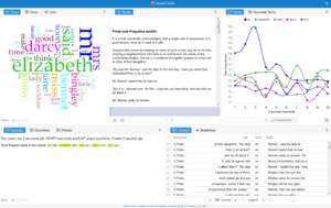
Text or edited and prepared data can by studied and analyzed in new ways and ‘plotted’ so that it can be saved and shared with others.   Using Voyant allows others to explore your data through interactive panels that can be inserted into online publications and presentations.   Voyant can also be used as a development platform to design new forms of analysis and visualization.  The main visualizations are: word frequencies, word clouds and “distinctive words”.

I am also including a link to the scatterplot for this corpus.  Clicking on the “Analysis” option > Principal Component Analysis provides  further evidence of the significance of “race” as a feature of slave experience.   http://voyant-tools.org/?corpus=2d0c91a1da599627fea6d35d607795a0&view=scatterplot&stopList=keywords-96814a63d28a5e281f75e02c891dcdbe


The trends graph indicates the significance of location.

I found Voyant to be an interesting tool which will be of great use when texts are clearly comparative.  It is great for collating data!  It provides the ability to analyze text to see trends in language and usage.  The word cloud is interesting and illustrative.  In the Slave Narrative data set on which I was working the common words were Old (which I ignored as the subjects of the text were elderly), Come and Time.  Whereas I would have expected more direct slave references which were secondarily popular.  The nature of the documents (by state) also provided insight into regional variations, but also made me recognize the states from which the largest number of narratives was drawn, would bias the representations and conclusions.  Understanding the Data (Musher, The Other Slave Narratives) is critical to recognizing the significance of patterns.  Having a larger context besides the quantitative data is essential for interpretation.  Also it became evident as I was working with the Data, that my choices were subjective and these choices would also “skew” the results…my lack of technical prowess also would play a role in the accuracy or distortion of the results.

For the new user….agh!  I am sure this tool would be easy for humanists with digital strengths.  For the digitally challenged, it is probably pablum, and a good entry point to Digital Mining and Modeling tools…but we are entering a “Brave New World” where the faint hearted must learn to persevere.  I believe spending some time in the on-line guides would be very helpful.  I played around the examples and information on Voyant’s website, but before attempting a larger project – I would try to learn to manage and navigate the tool better.  Time being an issue, I could not do that.  My simple tasks became time consuming, because if I tried to backtrack or change some aspect of the data my progress was lost.  Trying to return to old screens or navigate between the tools was not as “friendly” as I hoped.  Transforming from a historian who uses traditional sources of evidence to build up thesis and wider connections – I miss the library shelf (Underwood, Theorizing Research Practices).   it is a dramatic change to reverse and drill down into the minutia of checked boxes, single characters and itemizing the search.   The good new is that when you get interesting graphs or can make unexpected connections and conclusions…ya feel great!

“Learning is not attained by chance it, it must be sought for with ardor and diligence.” Abigail Adams